TAGS: sutra, printer, Print Making, Jon Cone
Narrative form Jon Cone ..
“This particular methodology that I am using to produce Yatin Patel's prints on large sheets
of handmade Japanese paper was designed specifically for that high contrast imaginary. I
rejected the idea of printing black & white prints with color inks and invented a process in
which many shades of black ink are carefully combined to produce a smooth gray transition
from white to black. Using only one black ink does not have enough tonal response to
convey a large range of tonalities.
For Yatin's imagery, I am printing using a bluish gray ink to carry the mood in the
shadows. It peeks out from behind the blackest parts. I use a brown nearly as strong as tea
in color. I have three shades of pure warm carbon that make up the bulk of the gray tones
in the print. But, some orange ink, some greenish gray ink, and some purple gray inks are
overlapped carefully to shift and split the gray tones so that the images appear to be rich
and with considerable depth. These inks cannot be controlled by conventional methods.
The images are all printed from single channel grayscale images. The images in my
computer have no color information whatsoever. Besides making my own inks, I develop
my own software with which to print. I cannot use a traditional RGB color space, nor a
traditional CMYK color space with which to print. No conventional printing RIP software
can take a grayscale image and translate those portions of tone to the colors of ink that I
have designed.
My approach is similar to that of a fine art lithographer who "thinks" in terms of
separations. I make plates of ink that when overprinted result in a range of color and tone
that realizes the print. The amount of ink that is being printed must carefully be controlled
so that I have built my own ink linearization software. There is no conventional profiling
software that I can use. I am alone as a printmaker without any support from an industry
that has a wide variety of applications and solutions - and I prefer it that way. I choose to
print in a way that is closer to traditional printmaking than it is to digital. If you can
imagine how a color woodcut or lithographic print is built up of colors overlaying and
overlapping - then you can imagine what it takes for me to produce a Yatin Patel print on
the very heavy kozo/cotton Japanese handmade paper.
I make custom inks for artists and photographers whose work I print in my own studio. I
do not adhere to the conventional method of printing that requires CMYK (cyan, magenta,
yellow, and black) that is found in all modern inkjet printers. I also do not adhere to the
conventional imaging space of RGB (traditional computer imaging), nor CMYK
equivalents, yet I print with up to 12 different colors of ink.
I could choose to do it in an easier and more conventional manner. But, it would interest
me far less as a printmaker to work in a way that others do. Also, the prints produced
would not nearly be as rich and complicated. However, my intention is to produce prints
that appear natural. I don't want them to be about technique, nor require an understanding
or appreciation of my technique in order to be enjoyed. My hope is that I make prints for
artists that look unlike anything they could do for themselves or in working with other
Master Printers.
I make ink. While this is considered to be unique for a digital
printmaker, it was once considered to be a necessary skill for a
traditional printmaker. My background is a traditional printmaker
versed in intaglio, photogravure, serigraphy, relief print and
monoprint. I founded Cone Editions in 1980 and was the first
printmaker to adapt digital printmaking in 1984. I have always
made my own silkscreen inks and intaglio inks. In the early 1990s I
developed some of the first archival inkjet inks.
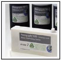
I now make a wide range of inks that are sold all over the world
under my own brands as Piezography® for black and white inkjet
printing, and ConeColor™ for color inkjet printing. While the
majority of printmakers around the world that have adapted my
inks adapt them to Epson printers, I prefer Roland printers for my
extreme fine art printmaking.
The Roland printer that I am using has been customized to allow
the passage of very thick materials. It heats the paper during
printing. It was originally designed as a commercial printer to print
solvent on heated plastics. I adapted it to work with my water based
pure pigment inks. I can easily change the inks to a palette, which is
appropriate for the artist's work. I can use up to 12 inks in this
printer. I first began using this printer to produce the monumental
prints for photographer Gregory Colbert and his Ashes and Snow
Nomadic Museum exhibitions.
I began that work in my own studio on a smaller scale using a 64"
wide printer. Eventually I would produce prints 14 feet in length
requiring 16 hours to print. The purity of the inks I make are
considerable as a result. Without prejudice, I can say that they are
of the highest standard possible and tests at the Aardenburg are
proving that I can produce inks on the same level as the major
manufacturers (Epson and HP). In some cases, I actually surpass
their inks in terms of fade resistance.”